
Project Overview:
PERRY proTECH had evolved beyond printers, but its brand hadn’t caught up. Six decades of printing expertise overshadowed its IT and cybersecurity services, while inconsistent messaging and design left teams telling different stories. Stock photography also overlooked a key part of the business: its employee-owners. We refreshed the brand to showcase PERRY’s full capabilities, bring its people into the picture, and give every team a consistent way to represent the company.
Services included:
Brand identity
❋
Messaging
❋
Brand guidelines
❋
Photography
❋
Motion graphics
❋
Sales materials
❋
Social media
❋
Brand identity ❋ Messaging ❋ Brand guidelines ❋ Photography ❋ Motion graphics ❋ Sales materials ❋ Social media ❋
Our Strategy:
Keep the recognition PERRY had earned, while giving buyers a clearer picture of everything it could do. Build an identity and message that sales and marketing teams could use consistently, and make employee ownership visible through the people behind the service.
The logo’s structure stayed. It held recognition and was already on signage and materials PERRY didn’t want to replace. We adjusted its colors and built a refreshed palette, typography, and design assets around it. That gave the brand a modern expression while respecting the investment already in place.
Creating A shared way to explain the business.
The message needed to connect PERRY’s printing heritage with its broader technology expertise. We developed messaging guidelines that gave teams a common way to describe the offering, alongside brand guidelines and design assets for marketing and sales materials. That gave employees a shared starting point for what to say and how to present it.
Featuring the people behind the promise.
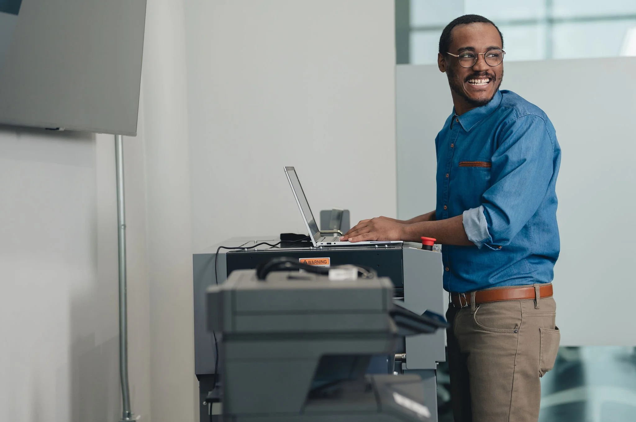
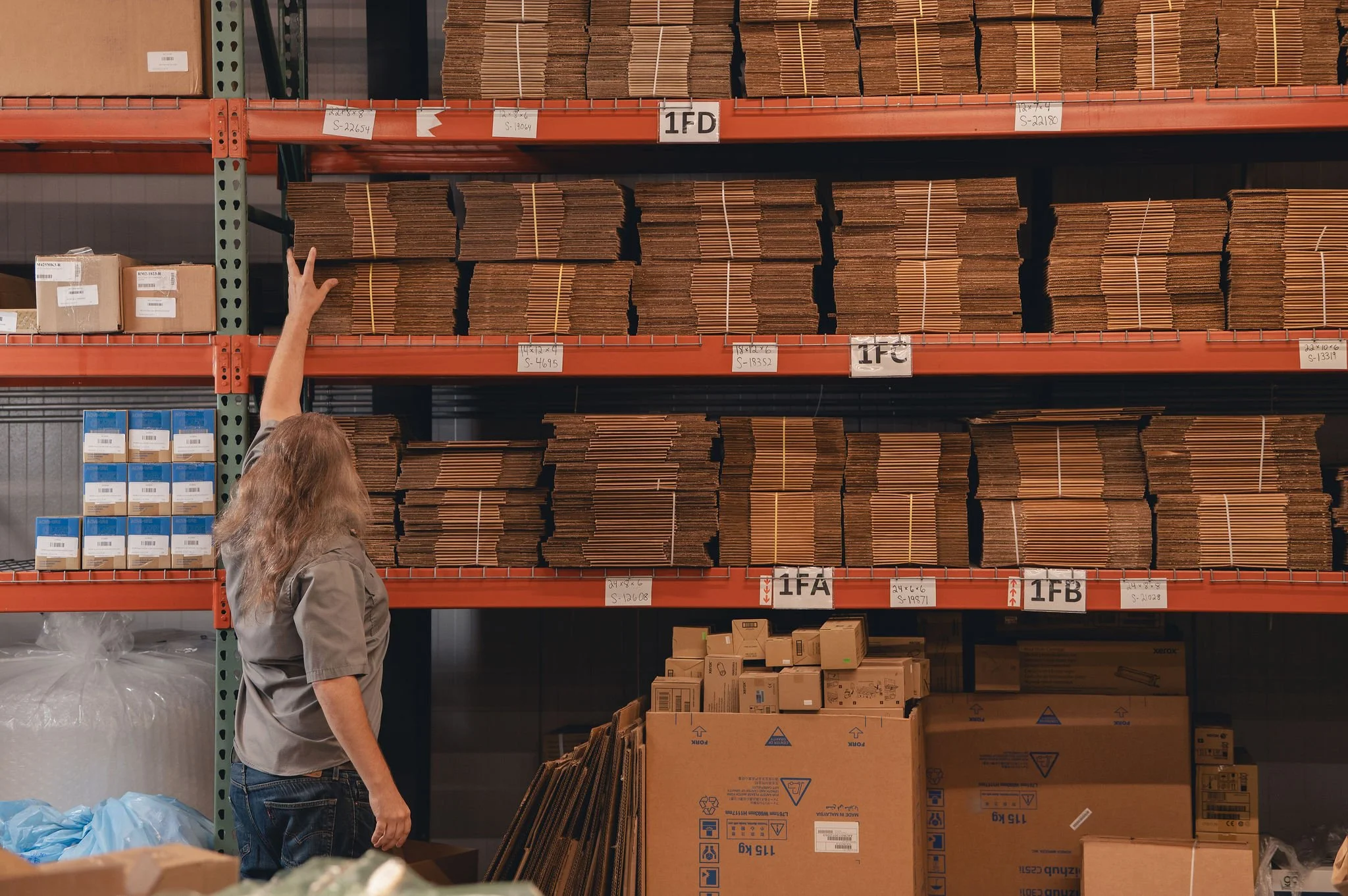
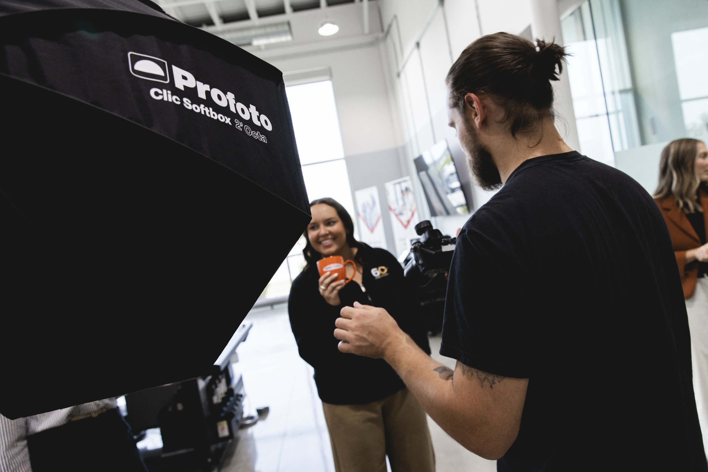
For an employee-owned company, stock photography left out an important part of the story. We photographed and filmed PERRY’s own team, with motion graphics supporting the visual system. The resulting library gave the brand original faces and footage to draw from and put the people responsible for the customer experience at the center of its marketing.





brand consistency in everyday communication.
The refreshed brand included a modern visual identity that retained its recognizable logo structure, a documented way to explain the broader business, and original photography and video of its employee-owners. The practical change was a common set of tools: teams had guidelines, design assets, imagery, and refreshed materials for presenting the same company.
Give customers a more clear picture of everything you do.
Your business has evolved. You’ve added services, built expertise, and solved bigger problems for your customers. But if your brand still tells the same old story, they may only think of you for one part of what you offer.
We’ll help you connect your identity, messaging, photography, and video around the business you’ve become—giving customers more reasons to consider you and your team a consistent way to tell that story.
Related case studies: